When it comes to decorating your home, choosing colors can be paralyzing. Fear of choosing the wrong color or worse past fails may have you shaking in your boots. I’ll hold your hand through the process and make it a lot less frightening. Color can get very daunting and there is plenty of science behind it; but for us regular folk, a few short cuts I’ve learned can garner stunning results.
This post contains affiliate links. Making a purchase after clicking on the link supports this website. Read my full disclosure here.
Let’s start with what not to do.
Don’t start with your favorite color.
I know, poor you. You love you some pink. But trust me. Your love for fire-engine red stilettos and turquoise journals may not create the vibe you want in an entire room. That doesn’t mean you can’t incorporate your favorites into your palette, you just need to be strategic about your decisions.
Instead of using your favorite color, go back to your Signature Style and check out how you want your room to feel and function. Your best bet is to create a palette that works within that paradigm. If you want a relaxing atmosphere, Hot pink walls aren’t’ for you. If exciting and trendy is your aim—go for it. Know your goal.
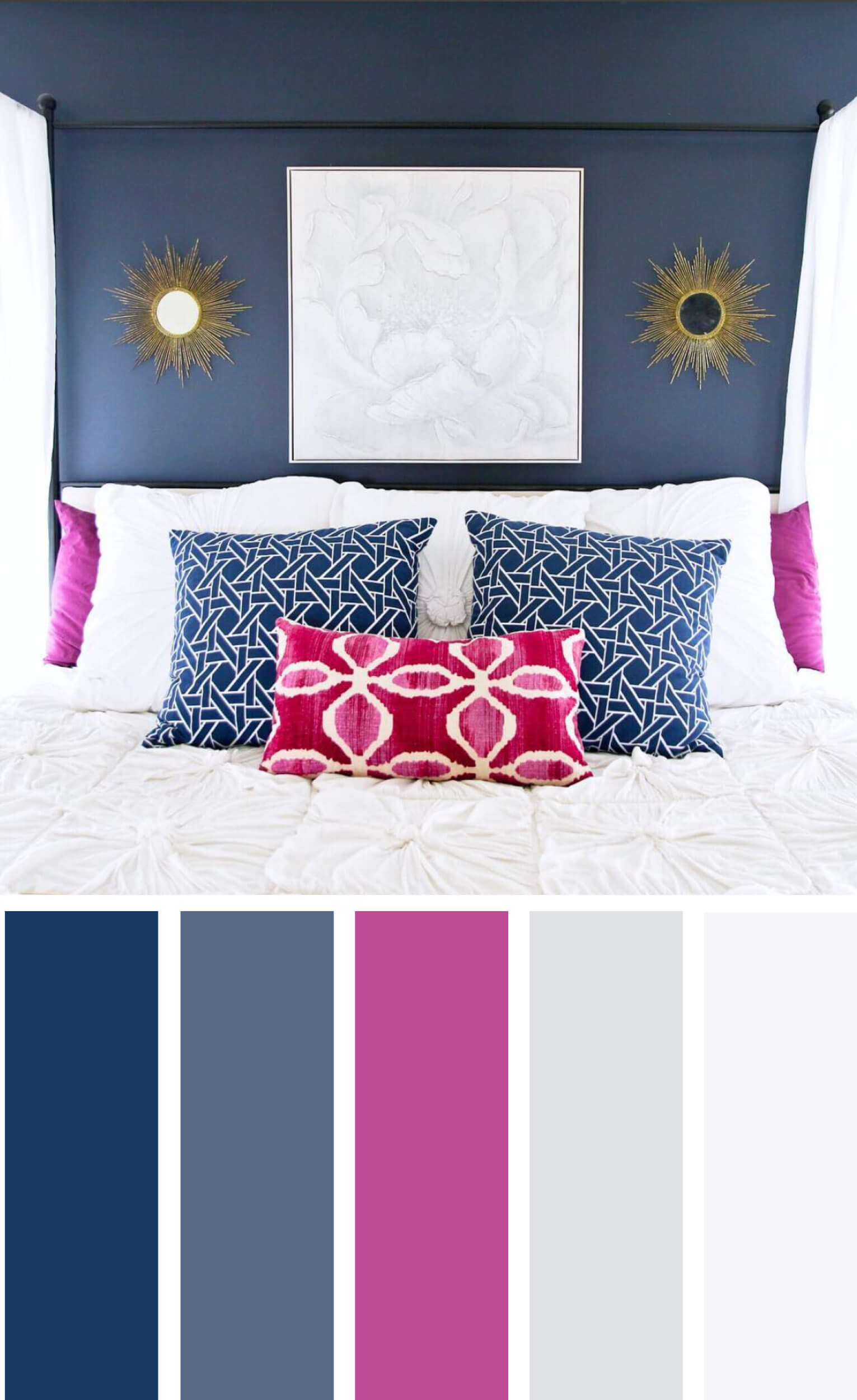
The gorgeous room below was designed by my blogging buddy Kristen Luhring over at Arieandco.com. Hot pink perfect without overdoing it.

3 Easy Ways to Choose a Color Scheme
-
Find a ready-made color palette
Select one of your top inspiration pics from your Signature Style Homework. Choose one or two colors that could satisfy the requirements of how you want the room to feel. These may not be the colors you end up with but lend themselves to the atmosphere you want to create. Don’t think about specifics for walls, furniture or accent items just yet. Simply select a jumping off point.
Once you have your jumping off point, visit Design-Seeds.com and search your color. Design-seeds extracts colors from photographs to tell a color story. Your aim should be to tell a story and evoke feeling when decorating your home. This site provides great options for telling a story by offering color schemes to coordinate with your original color. Genius, I know.
This is really the cheat way out. You could spend a lot of time looking at the color wheel and paint chips OR you could just go here. I’m making your life easier my friend.
Spend some time researching your color palette. Don’t rush through this. Your hard-earned dollars depend on you getting it right.
-
Select your color pallet from artwork or fabrics
Artwork, pillows and any other textiles are great starting points for color pallets. Busy patterns and floral prints are great for this method. You can select all or just some of the colors from your starting point. Stick to the hues in the piece in your room and you won’t go wrong.
Here are some amazing art prints from Minted.com that would make awesome starting points for room color palette. (Affiliate Links)
-
Use Software to custom select colors from an image
Now, if you are totally in love with an inspiration photo, you can extract a color pallet from your own photo using Microsoft PowerPoint. (Adobe PhotoShop and Adobe InDesign do it better, but typically everyone has access to PowerPoint.) Here’s how:
- Open a new document
- Insert your photo
- Use the eye dropper to pull out all the colors. (Choose Fill Color>>More Color Options and you’ll see an eyedropper tool. Click on different places of the photo to create swatches. Once you have swatches in the color panel, draw rectangles and fill them with your swatch colors.
(I created all the palettes on this post using this method.)
 Test different areas of the photo to ensure you’re getting the depth of color in your scheme. The photo above appears to have purple, dark gray and silver, but I pulled hues from the rug to reveal the taupe and lighter gray. Don’t feel obligated to use every shade and tint in your image. Two main colors, one accent color, and two neutrals create terrific balance.
Admittedly, this is a VERY elementary way of determining specific colors but it can get you headed in the right direction.
Creating a Room with Balance
Once you select a palette, you’ll want to think about the amount of each color in a room. Take special note of the photo attached to the pallet from Design Seeds or your inspiration piece. Notice the balance of color in the picture and the individual colors. When you begin selecting your wall colors, furnishings and accessories, you’ll want to pay very close attention to how much of each hue you add into the design. The photos will make it easy to determine when you need more or less of one color. A rule of thumb for creating color balance in a room is 60% base color, 30% coordinating color and 10% accent color(s).
Caveats for Your Selections
Sometimes the exact tints and tones you choose are not available where you shop. So be open to other colors that fit within the scheme. You can get paint mixed in any hue, but you may limit your accessory options if you select extremely obscure colors. I give you permission to do a little window shopping to see what’s available in store and online. The worst thing you can do is plan a room around a color that no one makes.
Also, take note that home décor follows trends. What’s hot now and easy to find in stores may be scarce next year. My suggestion is to choose a color pallet that stands the test of time and trends. If you want a trendy home, choose trendy colors for you walls that can easily be repainted. Incorporate pops of your trendy color with smaller accessories which can easily be switched out when you tire of them. For a more timeless home, yet up to date look, choose basic pieces in standard colors and mix in trendy colors with pillows and items that you can replace year after year without having to redesign your entire space. If you love the blush pink side chair buy it, but don’t spend a fortune on it knowing you’ll replace it in a year or so. I would hold off on purchasing that electric blue sofa; it’s an investment you may have to live with longer than you like.
We’ll talk more about what do with your color palette soon!


Rhonesha Bontemps says
I needed this post when I was decorating our living room. I’ll definitely keep this in my files once we purchase our new home. Or I’ll just hire you!
Kenyatta Harris says
Glad I could help!
Schilly Construction Inc says
Great ideas for how to get the right color palette for any room. Navy is really in, and greenery is this years Pantone color. Thanks for sharing.
Kenyatta Harris says
You’re welcome. Thanks for stopping by!
Choice Furniture Superstore says
It’s awesome. Wonderful ideas. Thanks for sharing this post.
Kenyatta Harris says
Thanks so much! I appreciate you stopping by!